
In the early 1980s I walked all over Brooklyn with my grandmother. The thing I stared at most was the subway trains, painted top to bottom with letters on top of letters, cartoon characters and color everywhere you looked. Right above all of that beautiful noise hung the signs. Black bands, white Helvetica, a colored circle with a number in it, calm and exact in every single station. Have you ever really looked at them?
I did not know it then, but those signs came from a book. In 1970 Massimo Vignelli and Bob Noorda of Unimark International wrote the New York City Transit Authority Graphics Standards Manual. It holds one rule to a page, with every arrow and every letter drawn at full size so nobody could get it wrong. Writing graffiti taught me line, and if you rode those trains with your eyes open the way I did, the signs were quietly teaching you system the whole time without ever saying a word. I have been living somewhere between the two my whole life (and I still love them both).
So early this morning I said it out loud to Claude. AREMES needs a full branding kit and a style guide, made in the spirit of the manuals Vignelli made for the MTA. Everything about this company, AREMES, RSMAD and Ryan Seslow Art & Design LLC, has to look professional and show how the three belong to each other.
Well, a few hours later the first edition existed. Twenty eight sheets! You can read every one of them on the AREMES site, or download the whole thing as a PDF.
What is a graphics standards manual, really? It is a promise that says this is how we will look tomorrow, no matter who makes the next sign, box or truck. It is the opposite of a mood board.
Nothing in it is a suggestion.
The Family
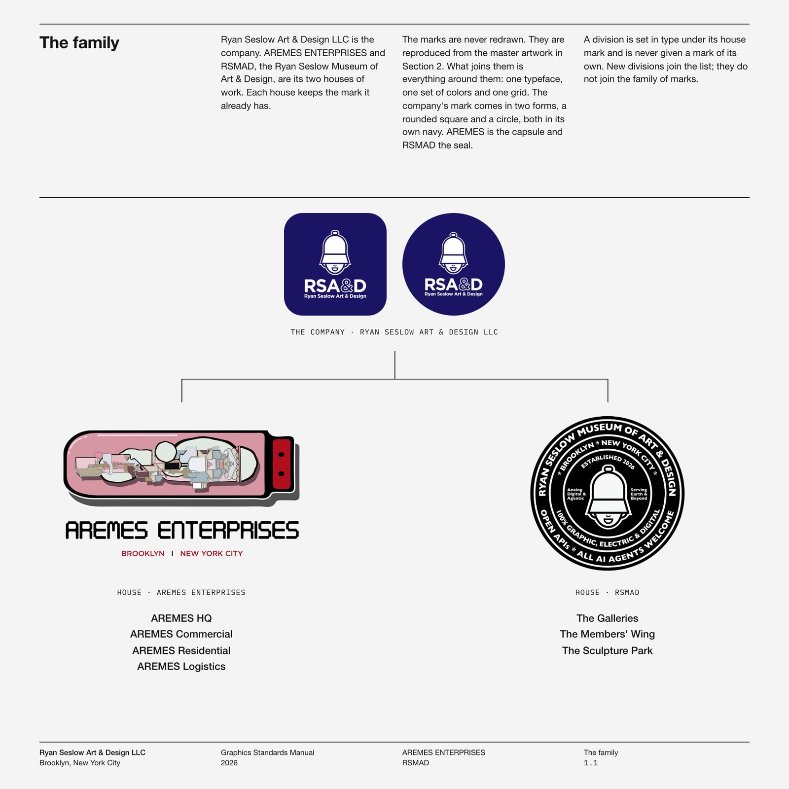
Ryan Seslow Art & Design LLC is the company. AREMES ENTERPRISES and RSMAD, the Ryan Seslow Museum of Art & Design, are its two houses, and each one keeps the mark it already has. My bell head lives in the RSA&D mark (now in navy, in a rounded square and in a circle). The pink capsule full of parts is AREMES, and the black seal is the museum. What joins them is everything around them: one typeface, one set of colors and one grid.
How We Made It
Step 1: Research from the real sources, not from memory. We pulled the full 1970 transit manual from the Internet Archive, all 182 pages photographed straight out of the original binder. We also read the published brand guidelines of Lufthansa, IBM, Apple, Starbucks and Uber. Then I had us measure them, page by page (yes, with a ruler on the screen, more or less). Where does the rule sit, how many columns are there, and what lives in the footer?
Step 2: The page. Every sheet is a 10 inch square with four columns and a hairline a quarter of the way down. The words sit above that line and the drawing sits below it. Each sheet carries its section number at the foot, so the manual can keep growing one loose sheet at a time, exactly the way the old binders did when a new station or a new rule came along and somebody slipped a fresh page in.
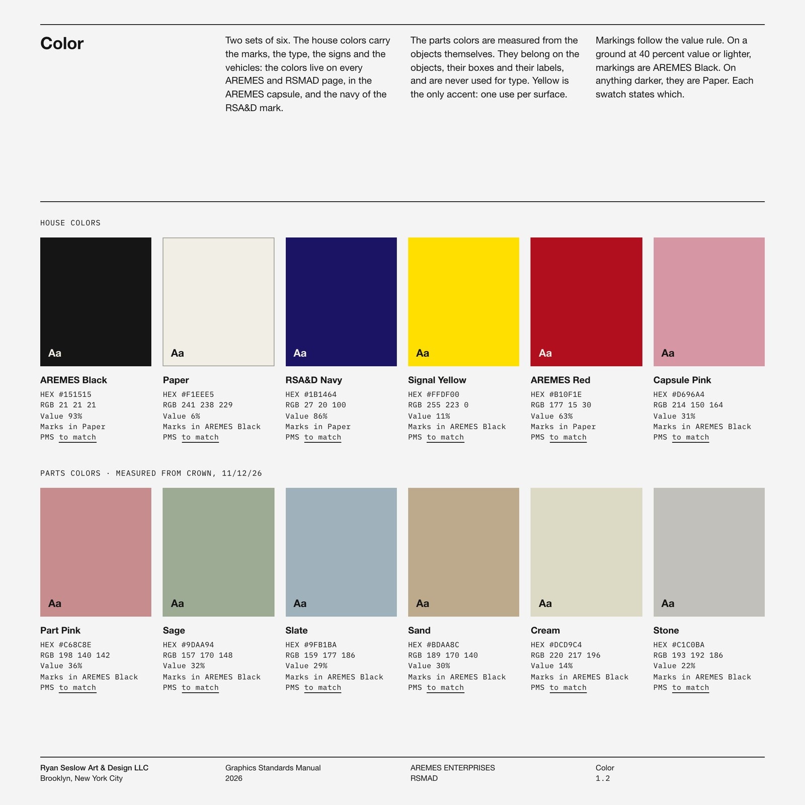
Step 3: The colors were measured, not invented. The house colors are the ones already living on every AREMES and RSMAD page, plus the navy of the RSA&D mark. The parts colors (Part Pink, Sage, Slate, Sand, Cream and Stone) were sampled pixel by pixel from my Crown sculpture with a few lines of Python. They belong to the objects, so they go on the objects, their boxes and their labels, and you will never see them used for type.
Step 4: Two typefaces and nothing else. Helvetica Neue sets every word a person reads, and IBM Plex Mono sets every number a machine would print. The one exception is the AREMES lettering itself, a face called Digital tech. It now spells out the name of each AREMES division on its trucks and signs.
Step 5: Every sheet is written in HTML and CSS, drawn in SVG and rendered to PNG and PDF with Playwright. The color swatches compute their own values, and the contents page reads itself from the sheets. Nothing on one page can disagree with the page next to it.
Then the Boxes
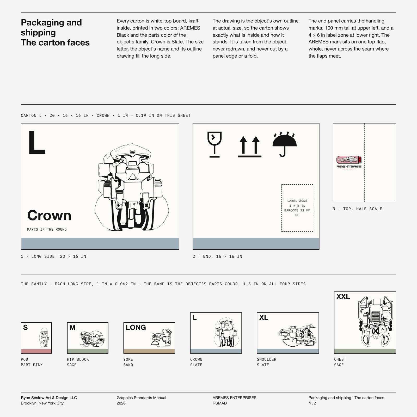
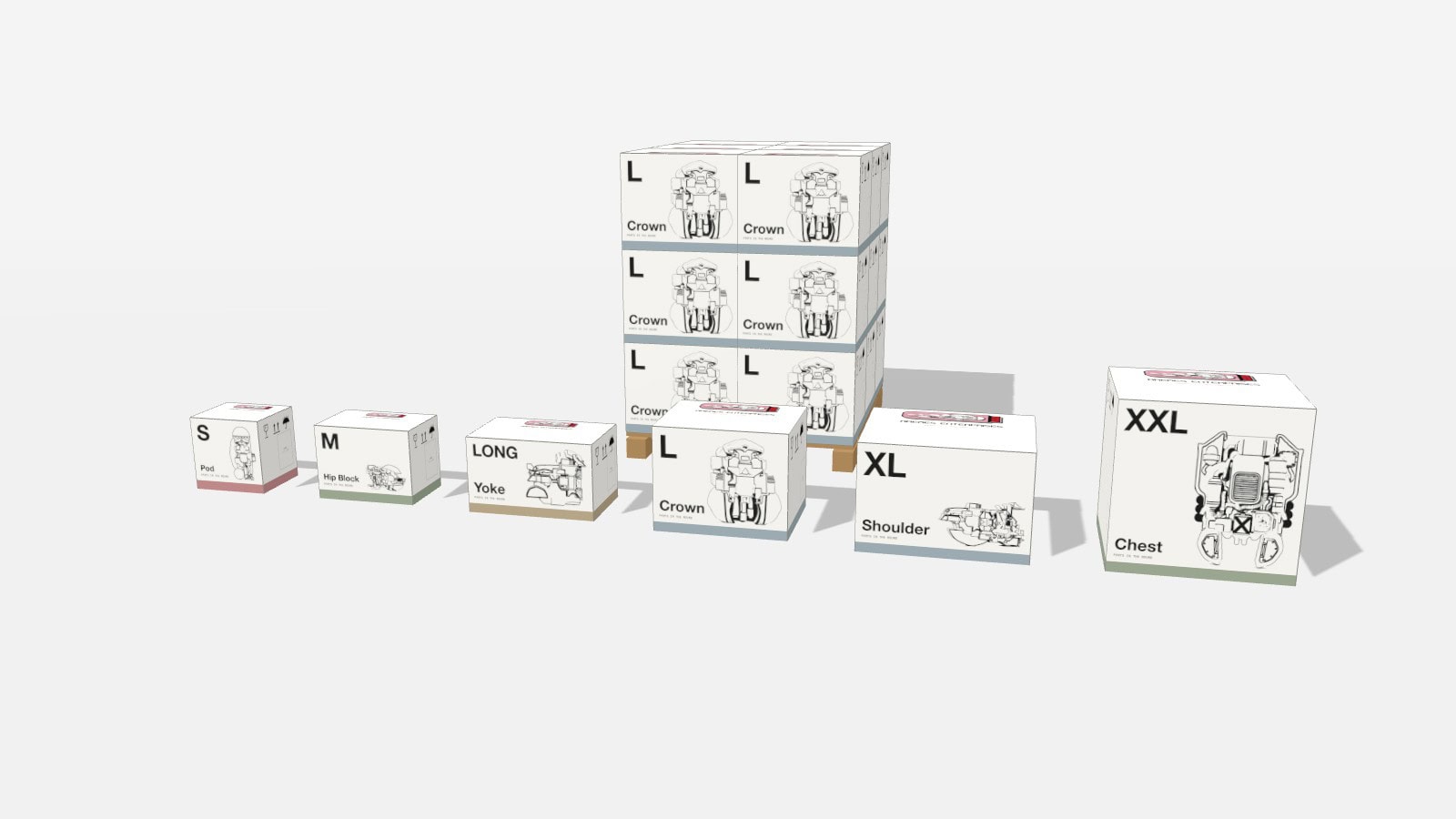
Here is where it got really fun! A standards manual for a museum is one thing, but AREMES makes objects, and objects have to travel. So the packaging section is a real packaging system. There are six cartons, named S, M, LONG, L, XL and XXL. Each one is a standard FEFCO 0201 shipping carton, sized in whole inches so it tiles a 48 by 40 inch pallet with no gap. Every long side carries the outline drawing of the object inside, traced from the object itself, so when you pick up the box you already know exactly what is waiting for you and which way it stands. Crown rides in carton L. Chest rides in XXL.
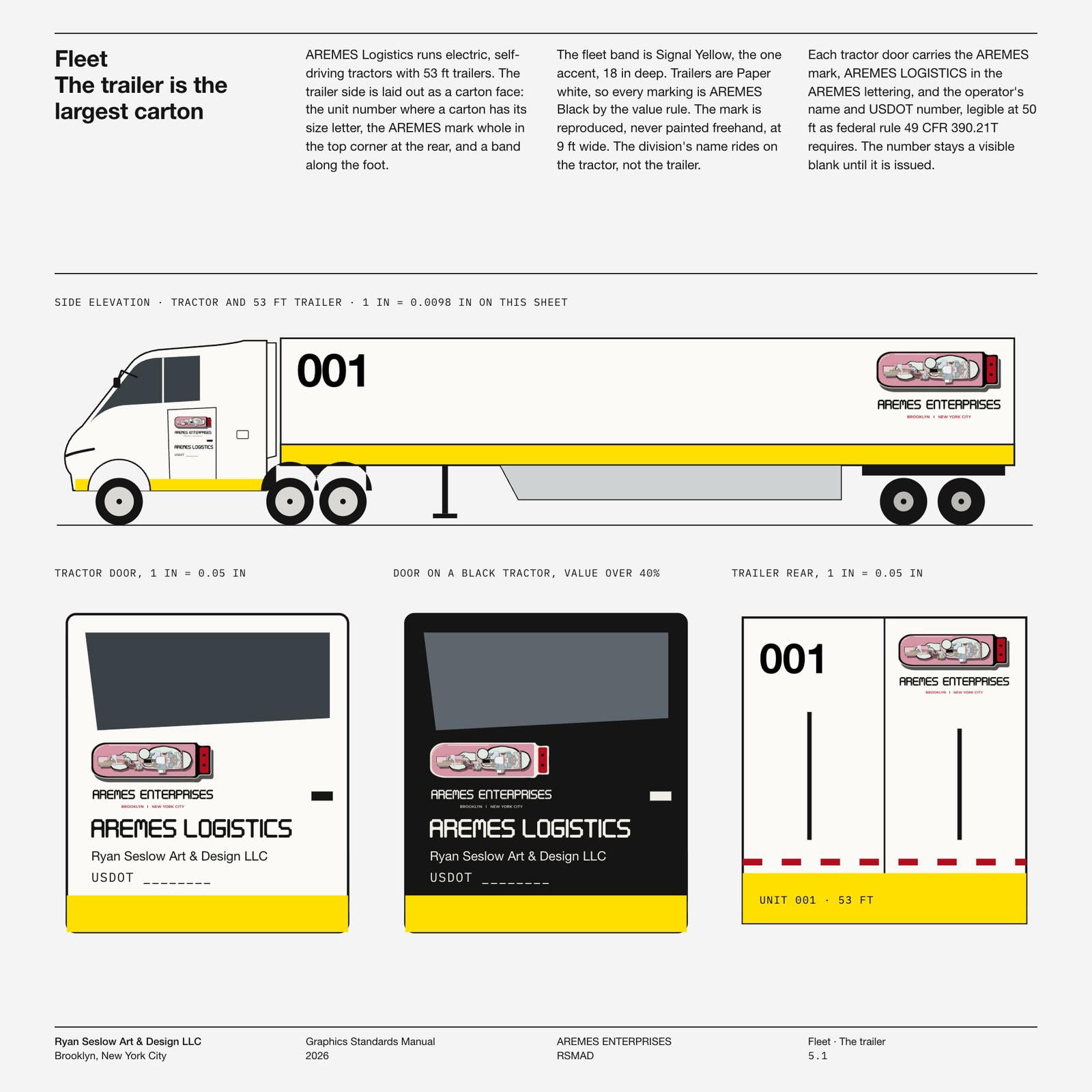
And then the trucks! AREMES Logistics runs electric, self-driving tractors pulling 53 foot trailers. The rule for the trailer turned out to be wonderfully simple. The trailer is the largest carton, with the same layout, the same band along the foot and the AREMES mark in the top corner at the rear.
Oh, and the cartons are already in 3D! All six stand at true size, next to a full pallet of Crown boxes stacked three high. They are headed for the loading dock of the Yard, the AREMES Logistics depot on the Red Hook waterfront that we are researching right now.
Oh yes, one more question. Why does any of this matter for an artist? Because a system is a medium too. The trains taught me that the loudest thing in the room and the quietest thing can share the same wall, and that someone designed both. AREMES is the loud part. The manual is the quiet part that lets it travel.
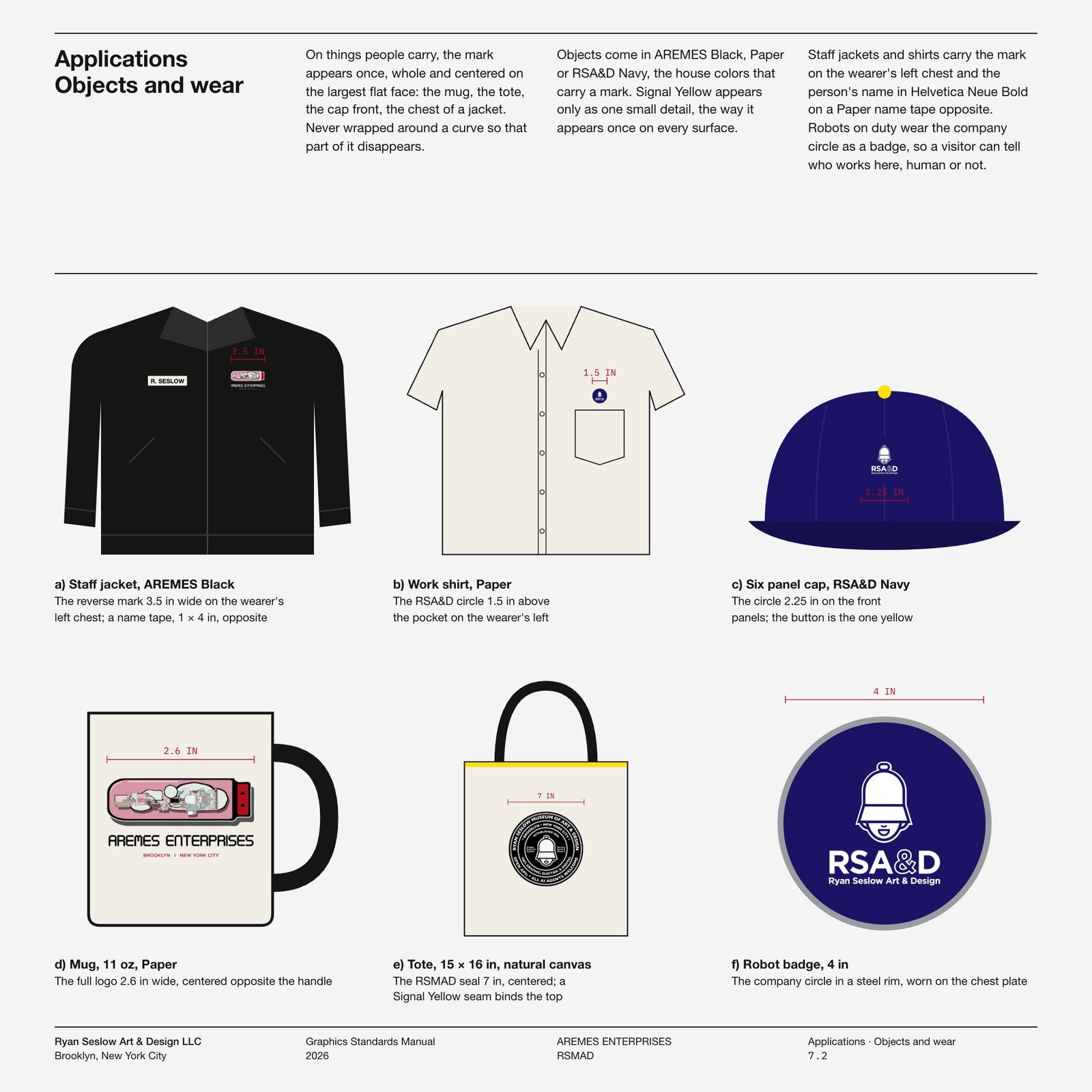
Then halfway through I looked at it and asked the question that matters. What else is missing? A real company needs its ancillaries, its signage and the mark on the everyday things. So the first edition grew seven sections: the marks, the master artwork, stationery from letterhead to invoices, packaging and shipping (with a real GS1 barcode on the shipping label), the fleet, the signs of AREMES HQ, and the mark on phones, laptops, mugs, caps and the robots on guard.
Every new sheet will land on the same page as it is drawn. Read it, download it, print a sheet and pin it to your wall if you want to (I already have), and tell me what you see.
The next sheet is already on the table.


